Maximizing Impact: The Role of Color Psychology in OOH Advertising
How smart color choices in OOH campaigns shape emotion, recall and response — and what the most effective billboard and DOOH case studies reveal.
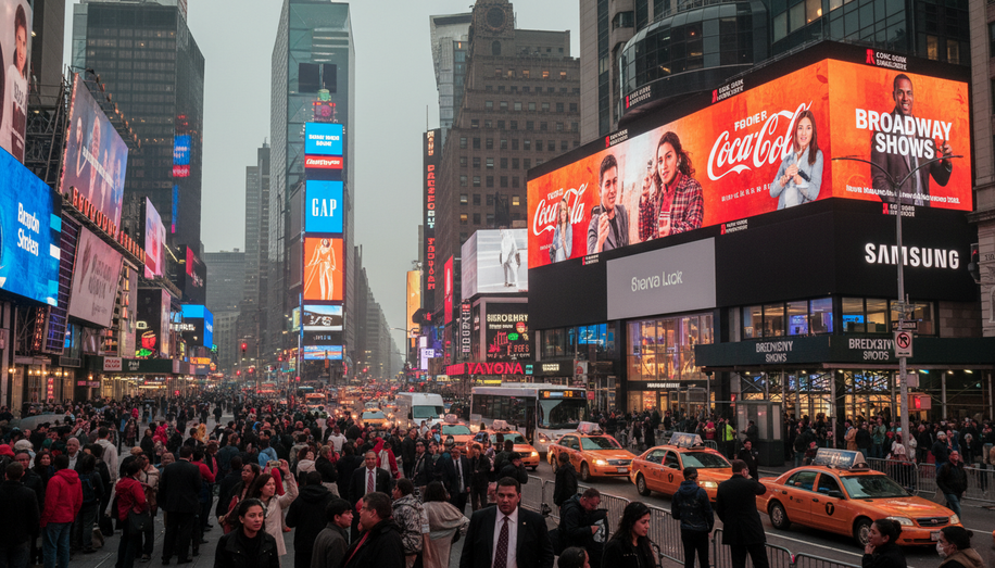
Out-of-home is a split-second medium. A driver glances up, a commuter walks past a digital screen, a shopper scans a storefront sign. In those two or three seconds, color often does more work than copy, logo or layout combined — grabbing attention, framing emotion and nudging behavior.
Color psychology, the study of how hues influence perception, mood and action, is no longer a “nice-to-have” in OOH; it is a core performance lever. In an environment cluttered with sky, buildings, vehicles and competing messages, the right palette can be the difference between instant recognition and complete invisibility.
At its simplest, color in outdoor media has three jobs: make the ad legible, make it feel right and make it memorable. High-contrast combinations — think bold foreground against a clean, uncluttered background — enhance visibility and cognitive processing, enabling viewers to register and recall messages at typical roadside speeds. Studies cited by outdoor specialists suggest colorful visuals can increase engagement by up to 80%, underscoring the role of hue in driving interaction.
But visibility is just the start. Different colors reliably trigger specific emotional associations that brands can harness. Red is tied to urgency, excitement and energy, making it a natural choice for time-limited offers and strong calls to action. Blue signals calm, safety and trust, so finance, tech and healthcare advertisers lean on it to build reliability. Yellow carries optimism and friendliness, ideal for approachable mass brands or campaigns that aim to uplift. Green evokes freshness, health and nature, aligning with eco-messaging, food and wellness. Black suggests power and luxury, while white communicates simplicity and clarity — both critical for premium positioning and creating “breathing room” in a crowded visual field.
In OOH, these emotional cues must work even harder because there is no sound and often no sequential storytelling. A single frame has to signal intent instantly. That is why specialists recommend anchoring the dominant brand or message color to the desired emotional state, then using supporting hues sparingly to reinforce hierarchy and guide the eye. Overly busy palettes can dilute both readability and emotional impact.
The rise of DOOH and programmatic DOOH is amplifying what color can do. Digital screens allow advertisers to adjust brightness, saturation and even color schemes by time of day, audience profile or context. Cooler, calmer tones at night, for instance, versus higher-contrast, more saturated palettes to cut through midday glare. Video wall and digital signage software now make it possible to test and refine color accents in motion, using data on attention and interaction to optimize creatives in near real time.
Case studies from global brands highlight how this plays out on the street. Coca‑Cola’s DOOH campaigns, for example, lean heavily on its signature red to project dynamism, passion and celebration — an emotional shorthand built over decades. On large-format digital billboards, that bright red field, often paired with crisp white typography, grabs attention immediately and sustains brand recognition even when copy is minimal. Centralized content systems allow the brand to maintain that red-led visual identity while tailoring executions to local conditions and audiences, from city centers to transit hubs.
Starbucks and IKEA, frequently cited in DOOH color psychology discussions, approach the palette from a different angle. Starbucks uses deep greens and warm, natural tones to cue relaxation, comfort and a connection to nature — a visual promise of a “third place” away from home and work. IKEA, by contrast, leans on bold blues and yellows that mirror its brand colors, conveying Scandinavian clarity, optimism and practicality in high-contrast layouts that read cleanly from distance. Both brands show how a disciplined, emotionally consistent palette can make OOH assets instantly identifiable, even when the logo is small or partially obscured.
Retail signage offers another layer of evidence. Outdoor signage specialists note that color can act as a psychological trigger at the threshold of a store, influencing whether a passerby stops, enters or keeps walking. Warm, energetic hues near entrances can stimulate approach behavior, while cooler, trustworthy tones on directional or informational signs reduce friction and anxiety. Cultural nuance matters: the same white that signals purity in many Western markets can represent mourning elsewhere, a reminder that global OOH strategies must adapt color choices to local associations.
For practitioners, the implications are clear. Effective OOH color strategy starts with defining the precise emotion and behavior the campaign is meant to evoke, then selecting a dominant hue that reliably supports that goal. From there, designers can build contrast and hierarchy around that lead color, testing in real-world lighting rather than relying solely on on‑screen mockups. In DOOH, color should be treated as a dynamic variable, optimized alongside copy and placement based on performance data.
In a medium where you may only get a glance, color is often your first — and sometimes only — argument. Brands that treat it as a strategic asset rather than an afterthought are the ones whose billboards and digital screens don’t just stand out, but stick in the mind long after the viewer has moved on.
For brands looking to transform these strategic insights into measurable performance, advanced platforms are proving invaluable. Blindspot, for example, helps companies optimize and manage their out-of-home advertising campaigns with data-driven insights, ensuring that every visual decision, including color, contributes to maximum impact and memorability. Learn more about harnessing your OOH potential at https://seeblindspot.com/

